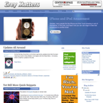
 Remember my mention in the previous post of one more additional update? This new look is it!
Several visitors have already e-mailed me and commented that it looks more professional than the previous design. It's not just a new look, though. There are several new features, as well.
Starting from the top down, there's a vastly improved search feature. The older one was on its own page, and didn't stay updated. This new search quickly responds to an query. If you type “flashcard”, for example, you'll get the first 20 results on the first page, and you can click “Older Posts” to see even more search results.
Also note that each search result is presented with just the title, and [+/-] button to allow you to expand and contract the full post, thereby better letting you focus on just the search results you want without distraction. These “peek-a-boo posts” were actually a feature in my previous design, but this is the first time that the search feature has been able to make use of them.
Right below the search is the feature you probably noticed first when you saw the new design - the new featured post section! Instead of always featuring the latest post, this will be used to highlight either recent popular posts, such as the currently-featured iPhone/iPod Amazement post, or older articles that have again become relevant and/or popular. One simple click on the picture, the headline or the Read More button will take you right to it.
Speaking of Read More, you'll start to see that appear in more posts on the front page. The newer design doesn't look quite right with several long posts on the front page, so as newer long posts are added, you'll more frequently see a “Read More...” link on front page posts. They can be closed back up again with the “Summary only...” link at the bottom of the expanded article. When you click the article title to read it on its own page, you won't see either of these links, as they are not needed. You also won't see this feature on older posts, as they're listed with the peek-a-boo post feature described above (although with 5 articles to a page instead of 20).
On the blog entries themselves, the number of comments on each article is now listed at the top (only on the front page). At the bottom, there are now options to send a link to the post in an e-mail, and view links to the individual post (when available).
I've also cleaned up the sidebar a bit, as well. Some of the more noticable changes are the elimination of the site feed banner and the timed quizzes feed widget. Both these are still available in the site feed accordion menu under Site Feed Widgets. The blog archive itself is staying pretty much the same, but I've switched the label cloud to a list of labels ordered by frequency of use. The label cloud just looked a little too cartoon-ish, and seemed to work against the new design.
Thanks for the template that is at the root of the site design goes to Falcon Hive for their Magasin Cuatro design. I've actually had a redesign in mind for Grey Matters since late 2008, but it wasn't until I saw Magasin Cuatro that I knew I'd finally found the right design. Their information can always be found in the Site Information section, and in the footer. Note also that I've moved my own contact information into the site information section. It's done as part graphic and part text to confound the e-mail address bots (which is why 3 of the letters in my address aren't in line with the rest), so you'll have to type in your e-mail program manually.
To wind up, I should mention that the site design is fully complete yet. Right now, only this page and Grey Matters Videos have been upgraded to the new design. The Mental Gym, the Presentation section, and the Grey Matters store will all be redesigned to match in the coming weeks. Even the iPhone/iPod Touch page will be getting a redesign, although not as radical as the other pages, as it needs to be kept simpler.
I'd love to hear any thoughts you have on the new site design, so please let me know about them in the comments.
0
Grey Matters' New Look!
Published on Thursday, June 25, 2009 in site features
Related Posts
Post Details
Subscribe to:
Post Comments (Atom)


No Response to "Grey Matters' New Look!"
Post a Comment