
 So, how do I kick off my 7th year of blogging at Grey Matters? By creating a mobile version of this site!
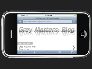
If you're visiting Grey Matters on a mobile phone, you've already noticed the difference. If the site detects your mobile device, it will automatically redirect to the mobile blog for an easier reading experience.
Yes, there has been a Mobile button at the top of this page since the new design was added. Originally, it went to a separate mobile blog that never really developed (and has now been deleted).
Now, however, that Mobile button has a brand new function! On both this blog and the video section, clicking the Mobile button will immediately take you to the brand new mobile blog. Further, if you're looking at an individual post,as you are now, a monthly archive page, such as this one, or a label page like this one, clicking the Mobile button will take you to their corresponding mobile pages.
If you decide you prefer the standard web version, simply scroll to the bottom of any mobile page, and click on View web version.
Due to the use of special interactive features such as tabs and quizzes, the Mental Gym and Presentation don't have mobile versions. Clicking on the Mobile button anywhere in these sections will simply take you to the mobile version of the blog.
Just as in the regular blog, you can view and post comments below each individual mobile post, as well as go back and forth to newer and older posts.
Don't forget that the web version is also also designed to be accessible by smartphones and tablets.
If you have any comments, criticisms, or suggestions regarding the new mobile blog, I'd love to hear about them in the comments!
0
Grey Matters Goes Mobile!
Published on Thursday, March 17, 2011 in site features
Spread The Love, Share Our Article
Subscribe to:
Post Comments (Atom)
 Posts
Posts


No Response to "Grey Matters Goes Mobile!"
Post a Comment